Have a question? Enter a search term. Or give us a call at 1-888-518-0818

“Dashboards” is one of the main “Centers” which you can see at the top of your screen. Since these “Centers” are controlled by permissions, you may not be able to see this particular “Center” from all profiles. If you are missing one of these options, please contact your office administrator.
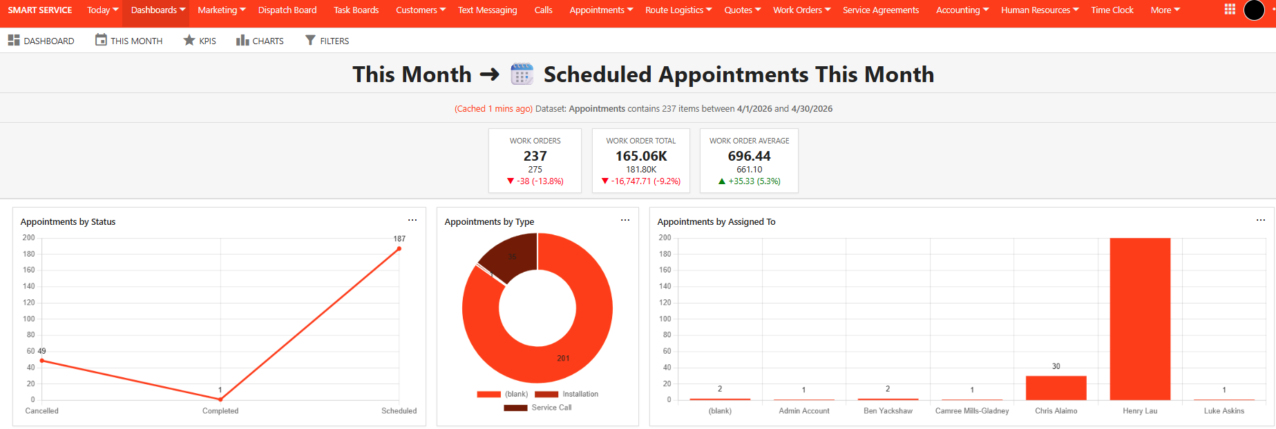
The Dashboards Center contains a visual representation of the data you’ve entered into Smart Service Cloud. While these representations aren’t our reporting feature, they provide graphical representations of the same data. You can always take screenshots of these charts and insert them into presentations.

A Dashboard provides a flexible way to monitor performance and trends within Smart Service Cloud. By combining KPIs, charts, and filters, you can create meaningful visualizations to support daily operations and decision-making.
Log in to Smart Service Cloud and select "Dashboards" from the main menu.

When you access Dashboards, you can create and configure a new dashboard by selecting “Dashboard” and then selecting “+ New”.

Enter a Name and Description for your dashboard, and utilize the panel to the right to add emojis. Select “Create” to save the dashboard.

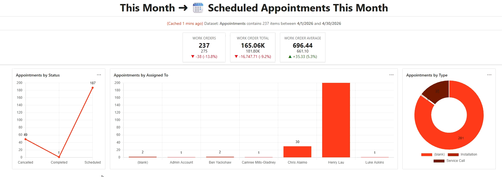
KPIs provide quick insights into your business performance.
What KPIs Display:
● Current date range value
● Previous date range value
● Comparison between the two periods
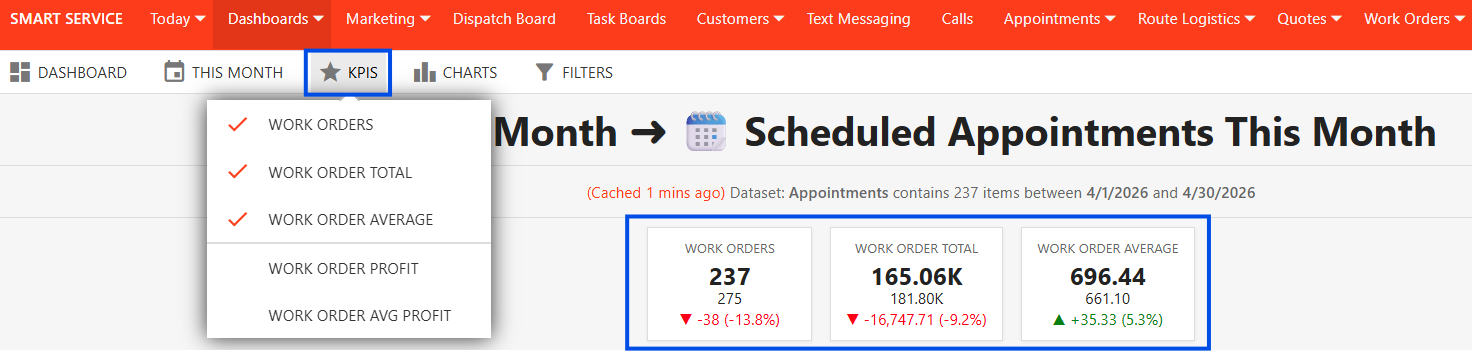
1. Select "KPIS"
2. Choose the desired KPI metrics
3. Set your date range
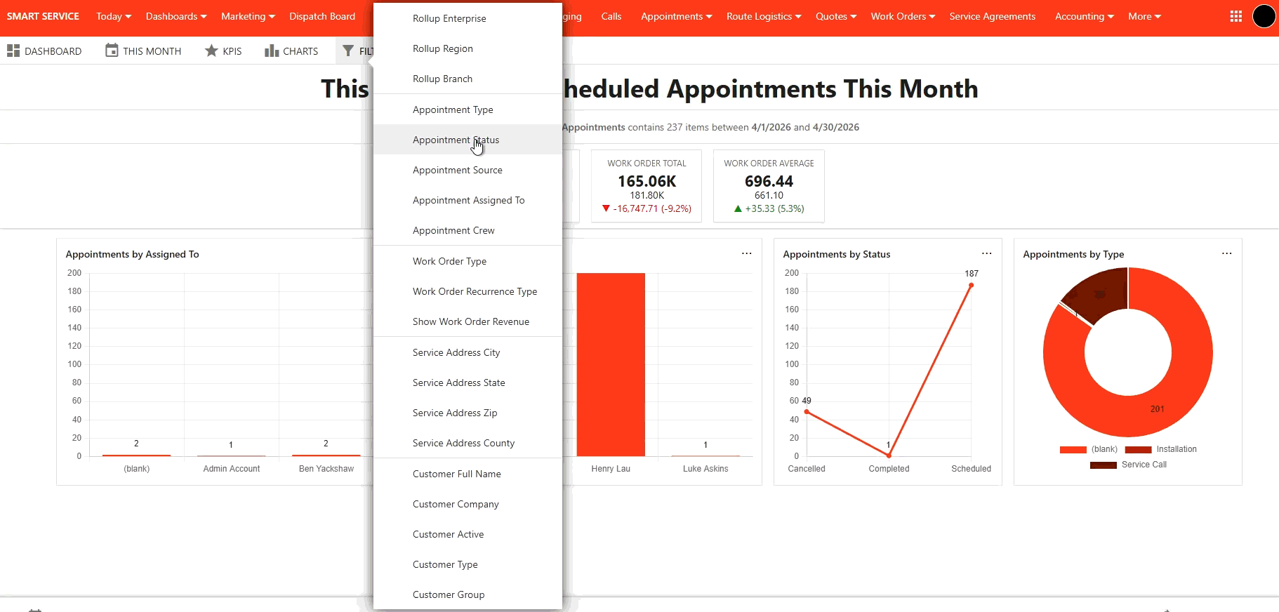
Filters allow you to refine the data displayed on your dashboard.
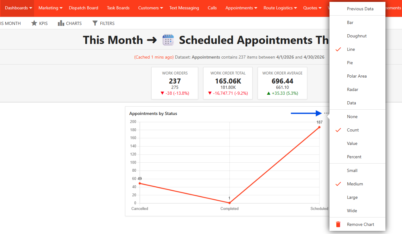
● Different chart styles
● Display settings and customization
● Option to show previous period data for comparison
1. Click on the Charts option and then select the type of chart you want to display.

2. Configure chart settings by selecting the ellipses (...) on the chart. The drop-down will allow you to select the Chart Style, Display Settings, and Chart Size.
3. To change the display order of charts on your dashboard, simply drag and drop them to the desired position.
Filters allow you to refine the data displayed on your dashboard. Filters will update both KPIs and charts based on your selection.
1. Select the Filter option
2. Apply relevant criteria (e.g., date ranges, job types, employees, etc.)
To remove a filter, first ensure the applicable filter's selection is set back to "all." Then, you can use the filter drop-down to remove the active filter. This guarantees that the filter's properties are correctly removed from your dashboard.
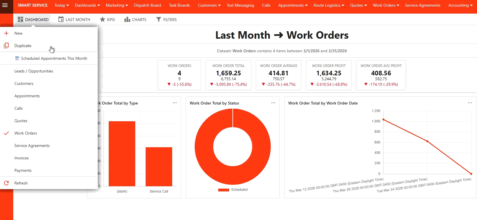
To duplicate an existing dashboard, select "Duplicate" from the Dashboard dropdown menu. Enter a new Name and Description, and then select "Create".
This action saves the duplicate as a separate entity, preserving all the original elements, including saved KPIs, charts, filters, and date ranges. Duplicating allows you to quickly reload and reuse a dashboard without needing to reconfigure its settings.
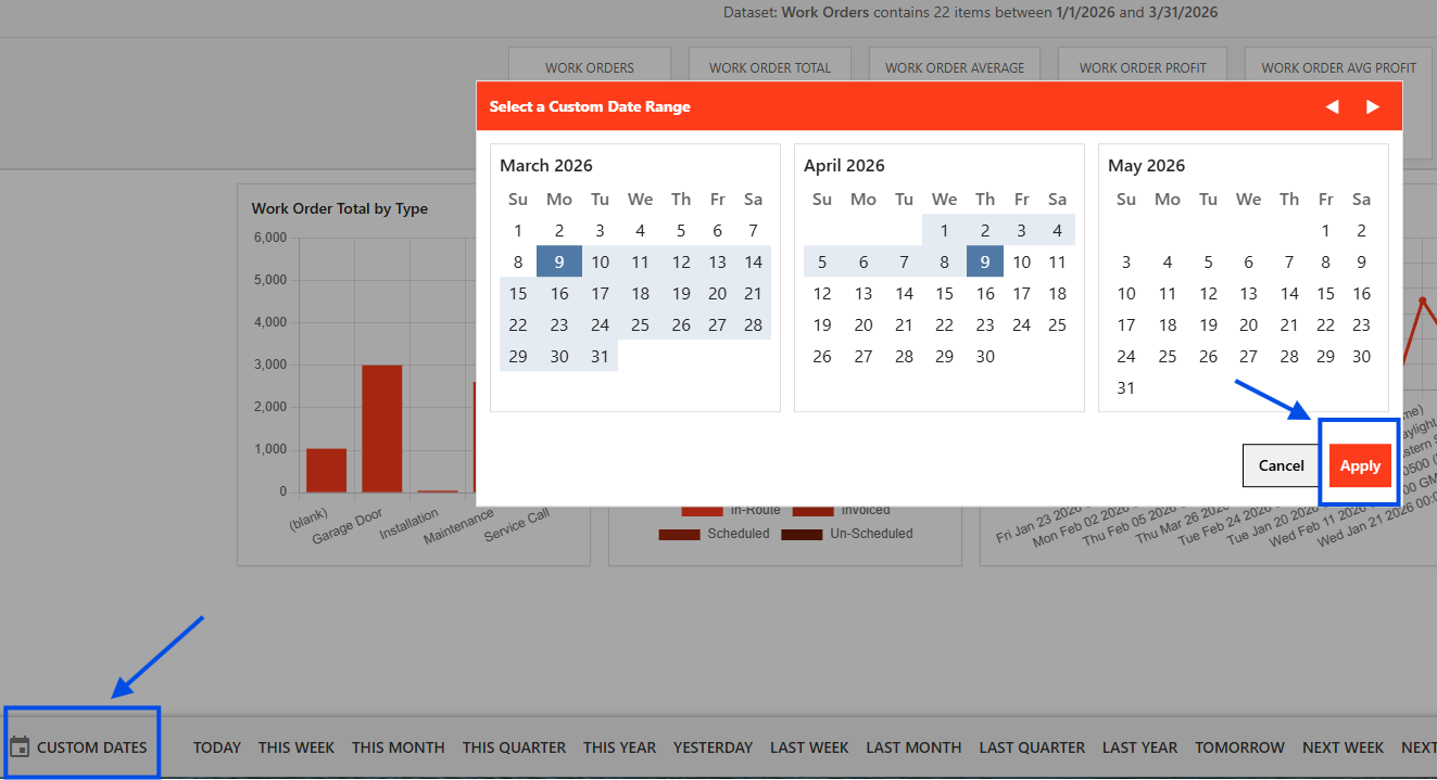
To set a Custom Date Range for your dashboard, follow these steps:
1. Click "Custom Dates" in the bottom left corner of your dashboard.
2. In the Select a Custom Date Range box, choose your "Start Date" and then your "End Date.
3. Click "Apply" to activate the selected date range.
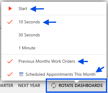
The Rotate Dashboards feature allows multiple dashboards to display automatically in sequence.
1. Enable the rotate dashboards option
2. Set the desired display duration for each dashboard
3. Select the Dashboards you want to include in the rotation
This is useful for displaying dashboards on shared screens or for continuous monitoring.
Near the top of your screen you will see a tabs for filtering and viewing options. We will cover each one individually.

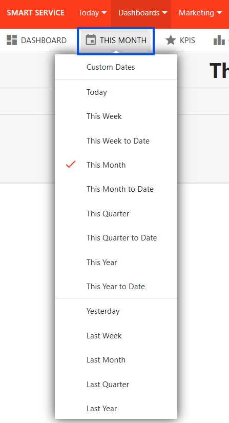
Date Filters provides you with a list of different time frames. You can also use the calendar on the left to view specific dates.

You can delete any applied filter by clicking on the "X'.

Insights is the default view that you see when you open Dashboards.
Data allows you to view each metric item in detail.

Map shows you the location where each metric item has occurred. You can click on each map pin for further details.

Customize allows you to change the type, the order, the size and the visibility of each chart, as well as giving you the option to reset them to their default.

Each chart has 3 dots on the top-right. By clicking on them you have additional options for showing data, changing the size of the graphic, and some additional filter options.
Since the options for each graphic will be different, the particular graphic you’re looking at may have different options available.

Read this article to learn more about filtering in Smart Service Cloud